My Kind of Infographic
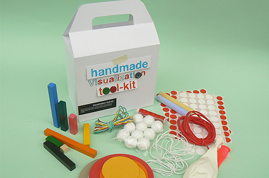
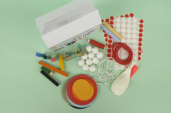
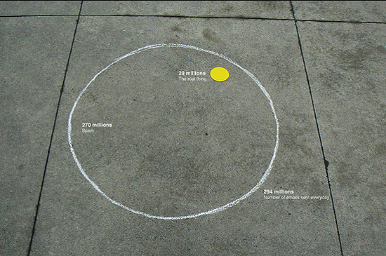
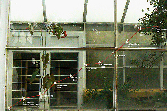
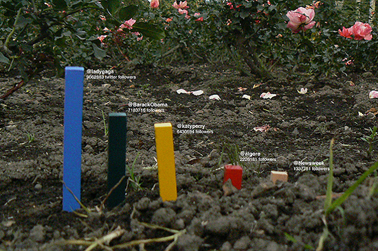
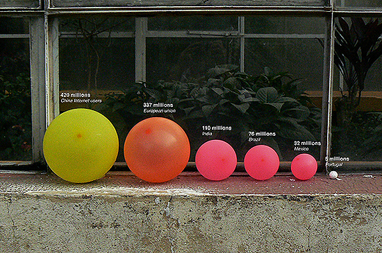
Jose Duarte is up to something. He’s taken what are typically computer-rendered information graphics and distilled them down to pieces of chalk, string, tape, balloons and a few other easily found items. He’s created a “Handmade Data Visualization Tool-Kit” for those of us who wish to tackle the wrangling of data in a more home-spun fashion. Brilliant. Thanks Flavorwire!
Infographics: 1) Number of real vs. spam emails sent daily. 2) Internet users 2000-2010. 3) Twitter followers comparison. 4) Internet users by country.


Thursday 04.28.11 at 12:56 pm
Your blog in fantastic! I´m your fan from Spain! Regards, Lila&Cloe
Tuesday 05.03.11 at 6:34 am
love this!
Thursday 05.05.11 at 3:27 am
very nice, lov’it!