Random Photo
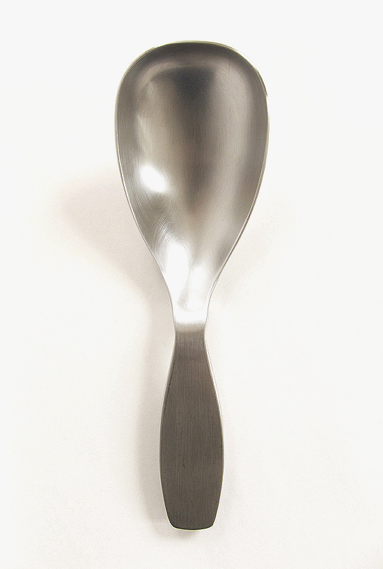
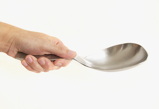
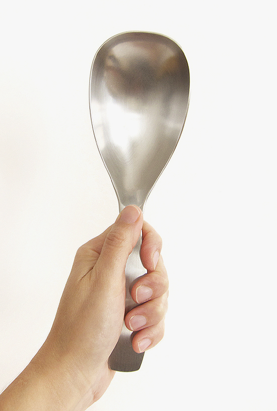
Sustainability can mean a lot of different things to a lot of different people. To me, the ultimate green product is the one that you never ever ever throw away. You buy it once and then you are finished. Done. End of story. And that thing you just bought…you use it! It’s the tool you reach for every time. This approach is not exactly the one that the manufacturing sector wants to promote, but it is a standard that I go back to over and over again. So, to that point, let me introduce the one and only serving spoon you will ever need or want. It was designed in 2000 by Antonio Citterio for the Finnish company Iittala. The thing is a workhorse. And what’s better, it looks good, feels really great to use and…here’s the kicker…it survives the cous cous test. It is the only serving spoon I have ever owned that does not spill a single grain from pot to plate. Pure genius. Yes, it’s a little pricey. For more info click here.
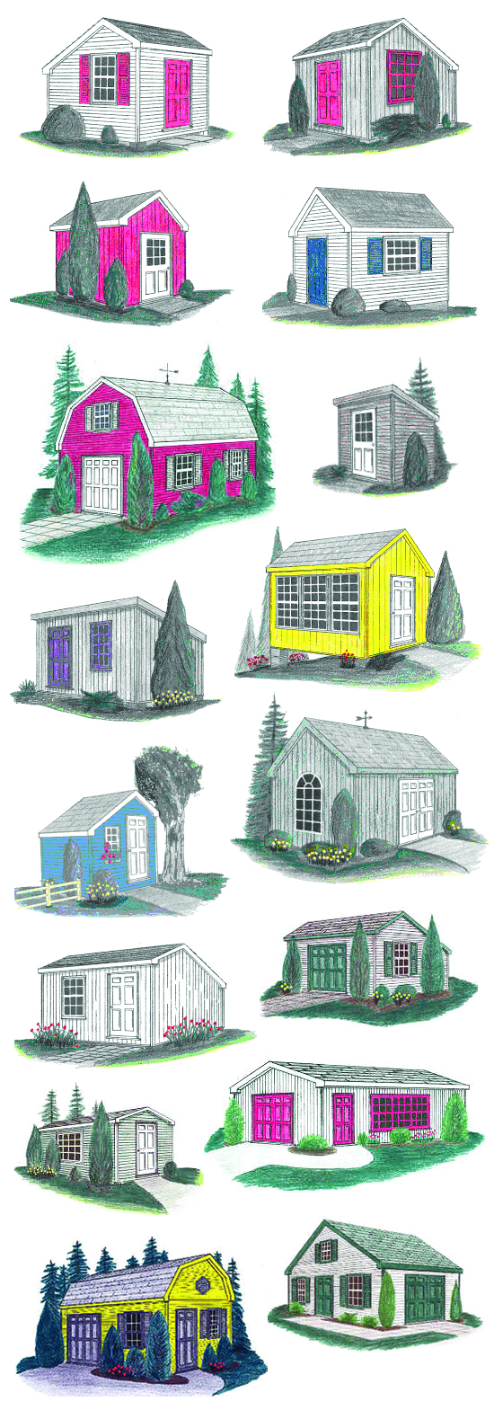
As a kid, my fantasy was to live in an RV. I was fascinated with the idea that everything had a dedicated spot and that there was essentially no space for anything extra. Dining tables converted to beds in the evening, and there were built-ins galore. Like a lot of people, my dream house has since morphed into a series of small sheds: One for sleeping, one for cooking and eating and relaxing and definitely one for working. If need be, I could easily combine both of the “non-studio” structures into a single unit. When I came across the Just Sheds site I found myself plotting some teeny future compound.
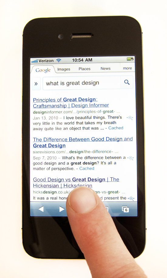
We all know that design can present itself as superficial or substantive or, more often, it’s some combination of both. We also know that when marketing, instead of need or innovation, dictates change, we find ourselves in the greatest amount of trouble. Good design is when form, function and operation are all considered and realized. And, at least to me, really great design is the convergence of all those elements but with the added goal of deliberately paring down and eliminating all extraneous detail. What one is left with is the absolute essence of a thing. Design in the hands of someone like Steve Jobs (and, to give due credit, Jonathan Ive and the many who work at Apple) was anything but a trivial matter. He made certain that we were not given a choice of how to use his products. Those devices dictated purpose and habits and touch. And they made us intuit our actions. Each successive generation of designs strove to get at the heart of how we converse with our environment. Ask yourself, have you ever seen someone really roughing up an iPhone? Probably not, because the interface and the form and the sounds all conspire to tell us how to interact with the thing. I marvel at Apple’s designs in part because of how they force our behavior into being something other than what it is. They even go so far as to demand both patience and attention. The many distinct little noises emitted by one or another device, as a result of touching a button or maybe scrolling down on a menu, tell us exactly what’s going on so we know if our actions have affected a change. So, not only is the “thing” pared down, but we are as well. We become less haphazard in our choices. And we ultimately become more precise and economical in our gestures. And, in the end, I believe we are the better for it.
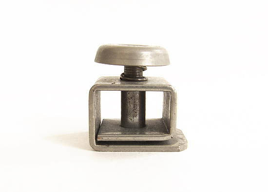
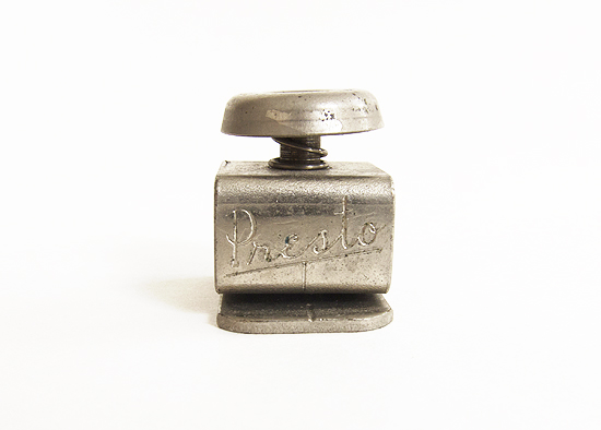
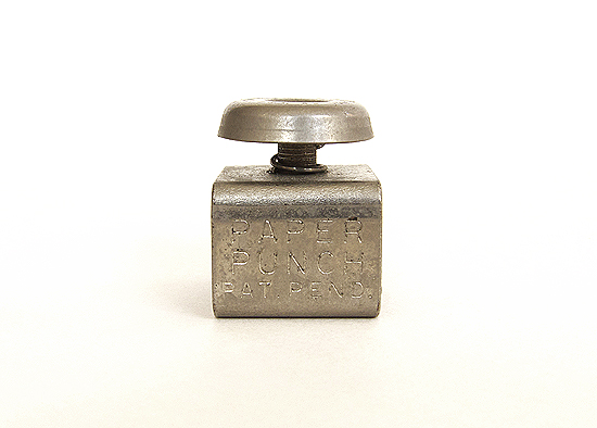
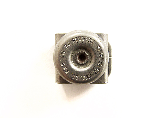
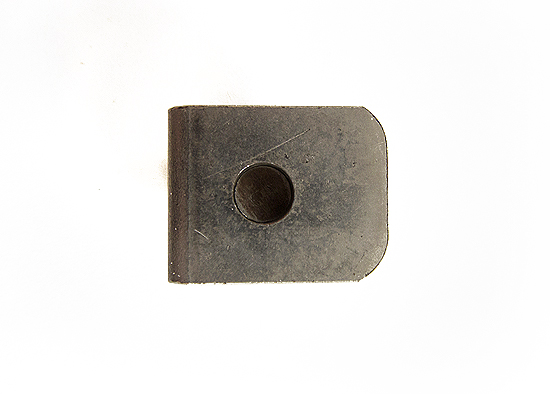
As a quick explanation of what this is: It’s a “Presto” single hole punch. It takes up a scant square inch of real estate. Slide a piece of paper into the slot, push the button, et voila, one perfect little 1/4 inch hole is created. I have no good answer as to why I have this thing. But, what’s crazy, is that I’ve had it since I was 8.