Tuesday 01.17.12
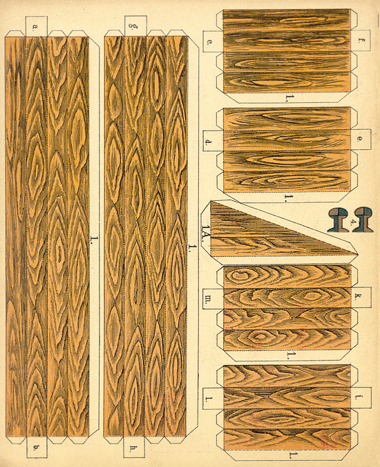
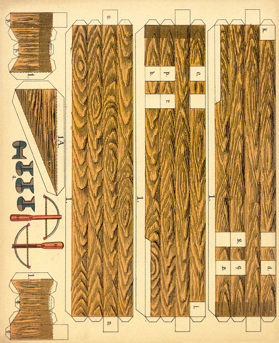
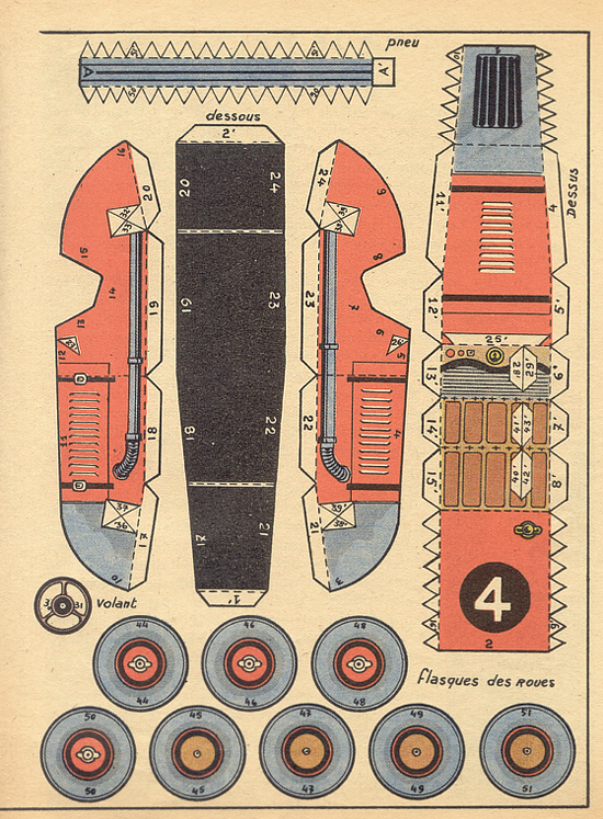
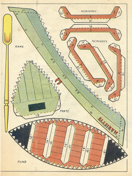
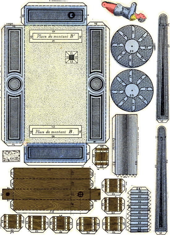
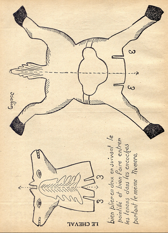
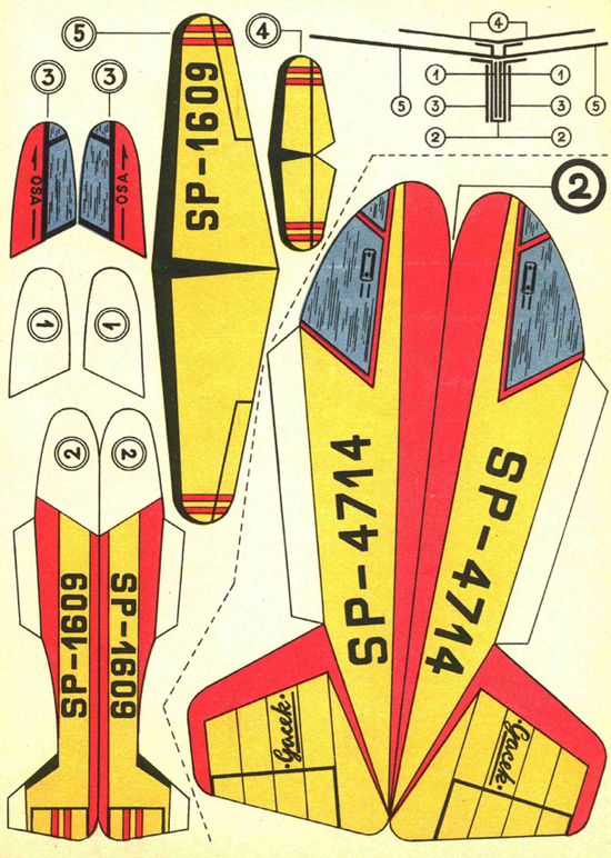
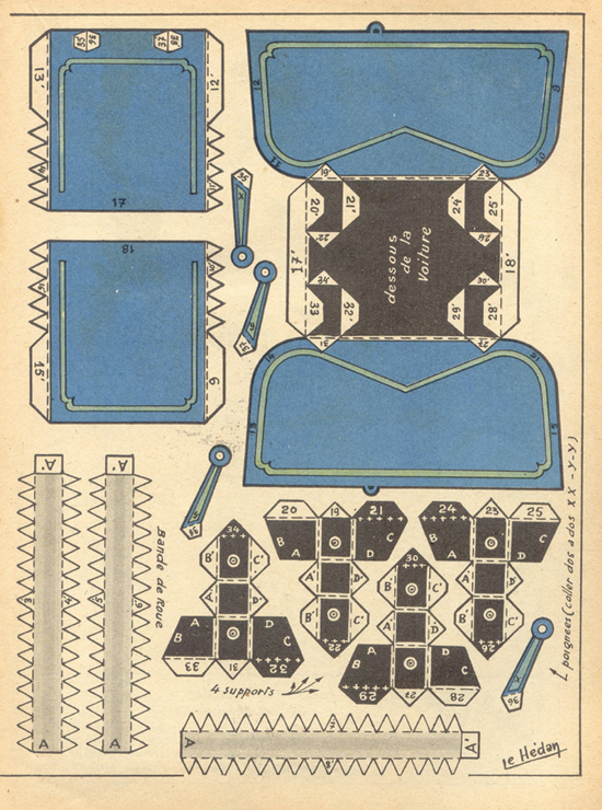
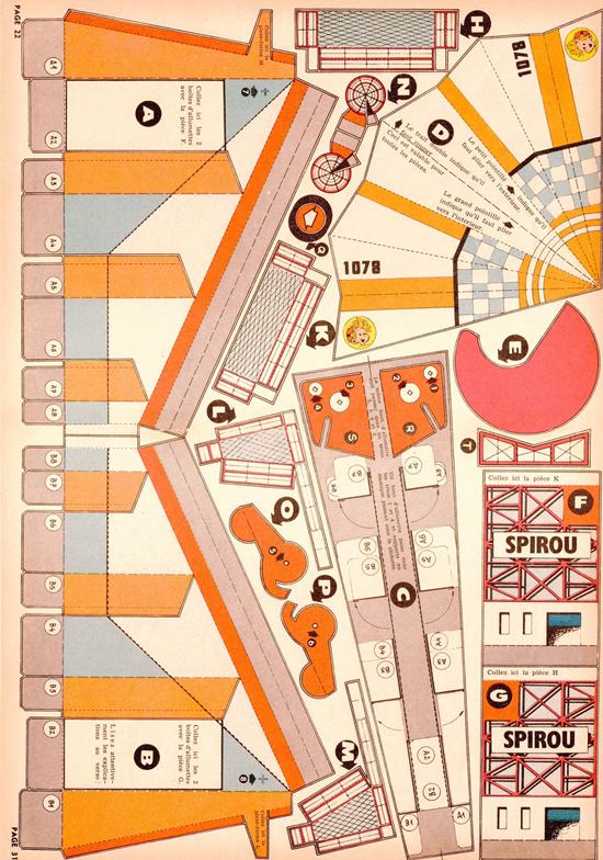
As an industrial designer, one of those skills in which one should have achieved a certain amount of fluency is the ability to create a three-dimensional object out of a series of two-dimensional shapes…and vice versa. This is something I have yet to master. So, is it any wonder that my attention is fixed on these drawings of disassembled objects? Just from looking at them, I can guess at what their final shapes are. But in order to be sure, I’d have to cut and fold. Of course, from Agence Eureka.
Thursday 10.27.11


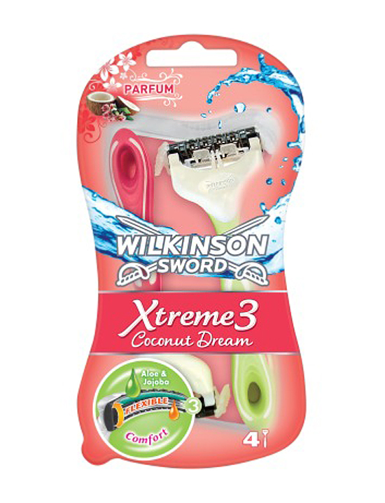
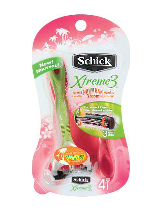
I was reading the actual paper version of the NYT this morning and was basically assaulted by the scent of perfume as I paged through one of the sections. Couldn’t figure out where the odor was coming from until I bent my head down to sniff an advertisement for…perfume. Blech. And then I was reminded of some razors I bought over the summer. They emitted a very pungent strawberry scent as soon as I removed them from the packaging. Again, I couldn’t initially figure out from where the aroma originated. And how had I missed the two little berries on the label? Something about this seems to have crossed a line. I’m still mulling over why it offends me. I did a little homework and found a story in the Times offering up various explanations (most of them pretty obvious, but still weird) as to why the last unscented bastion in our bathrooms has now succumbed to the forces of marketing.
Saturday 10.15.11


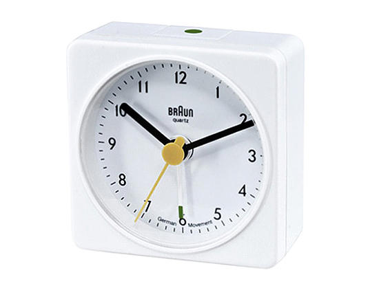
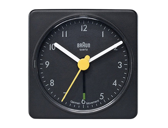
I went to buy a couple of new alarm clocks yesterday — we have a cat who is occasionally unruly and hurls everything on the bedside tables to the floor. no clock could stand up to such repeated abuse — and was reminded of how truly ridiculous we designers can be sometimes. As I was standing at the counter trying to decide between the black version or the white one and back again, the soft-spoken, very design-ey gentleman in charge of the shop inquired in the nicest way possible, “Does it really matter?” Instead of taking offense, as perhaps I should have, I burst out laughing. He’s right, it doesn’t freaking matter. It’s a clock for crying out loud. It’s unobtrusive, simple, well-designed. Who cares if it’s white or black? Would it really make a difference in my life one way or another? It’s not going to work better if it’s one color versus another. This particular clock is a re-issue of a design originally created in the 90s by Dietrich Lubs and Dieter Rams for Braun. Oh, and for the record, I bought two black ones.
Tuesday 09.06.11

I attribute these few words to Eric Asimov, a food and wine writer for the the NYT. He was referring to choosing a wine to pair with food (specifically oysters), not ruminating on the creative process. Although I suppose picking a wine to be compatible with a certain aliment could fall into that category. Anyway, I wrote it down and have been trying to remember it ever since. This is not to say that I don’t strive for exactitude, but I try to be mindful of it not becoming an end in itself. Or an obstacle to everything.
Wednesday 07.13.11

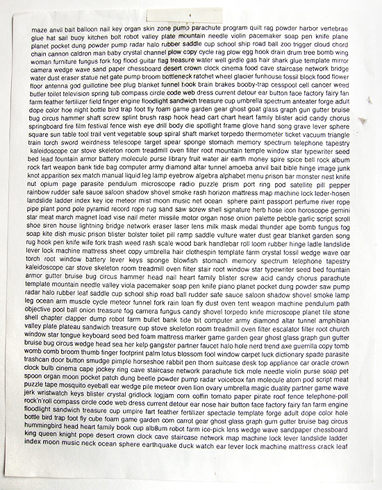
Need help getting out of a design rut? Trying to think of some copy for that new design of yours? Well, you’ve come to the right place. This little crib sheet works wonders when it comes to re-routing your thinking. This used to be on my wall in my old studio. When we moved, I packed it up along with all manner of other odds and ends (that will gradually make their appearance) and haven’t seen it since. I’m not sure where it came from, but here it is.
Copyright © 2010 - 2025 MELISSA EASTON, unless otherwise noted.


 5
5

