Tuesday 11.15.11
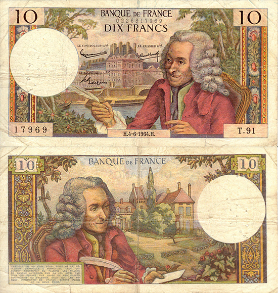
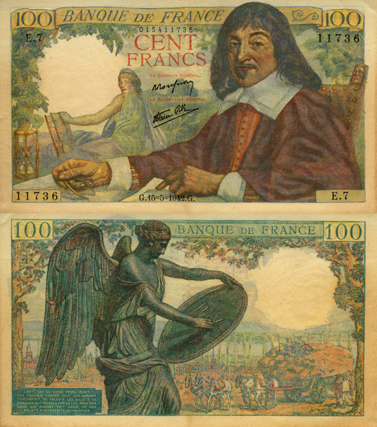
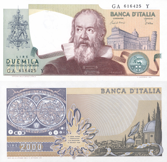
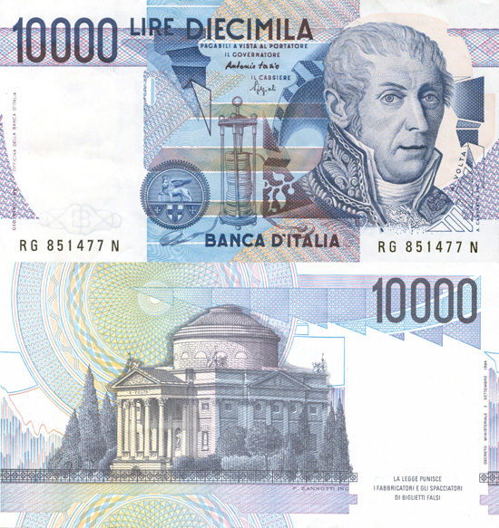
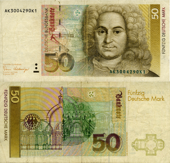
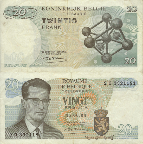
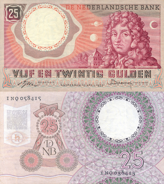
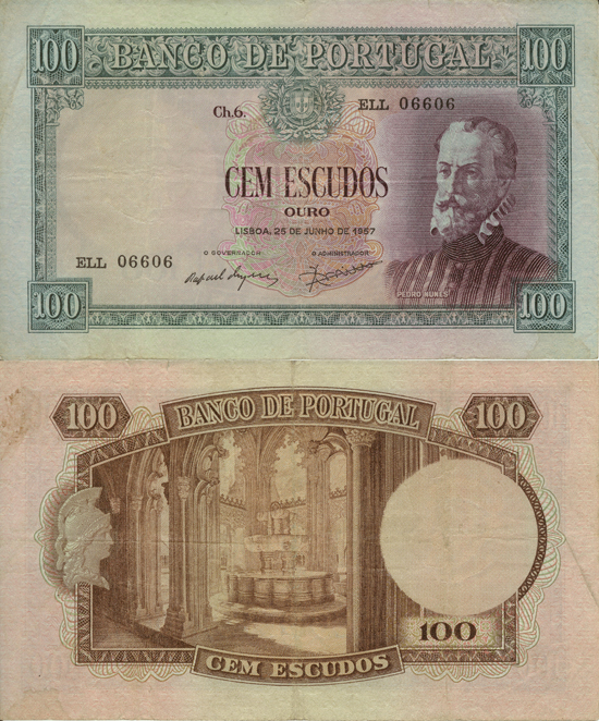
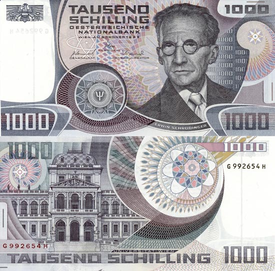
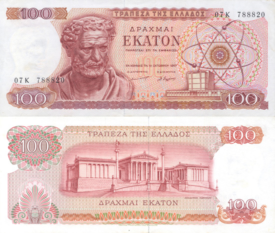
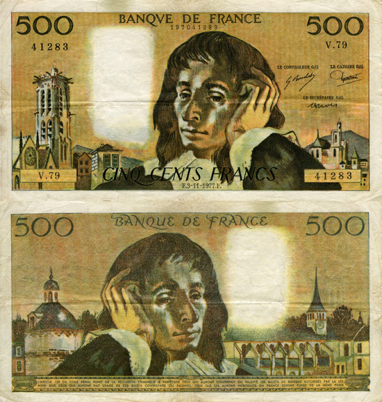
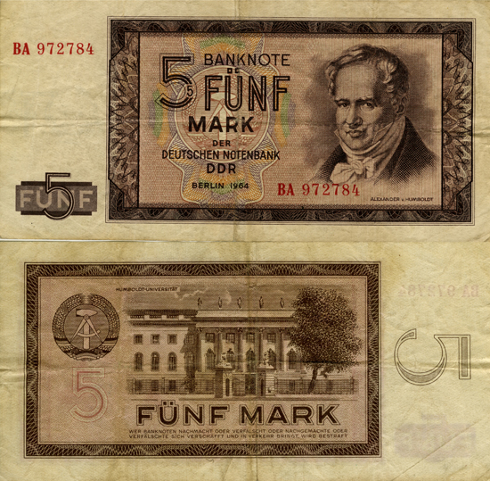
I’ve been following the European debt crisis with some bit of fascination, fear, horror and disgust. How the F*ck did we get here? Although their debt crisis is different from our own in some ways, it’s also borne out of the same greed, speculation, mismanagement, ideological differences, growing divisions of wealth and the list goes on…and on. I posited the question some time ago to someone way more expert than I in the field of economics as to whether they thought the euro was at risk. As often happens with so-called experts, they dismissed my query as ridiculous. And amateurish. Well, fast forward a few months. While the likelihood of the euro-zone being disbanded is unlikely, it’s still a possibility. A previously unthinkable one. Anyway, all this talk of euros made me feel incredibly nostalgic for the former currencies of Europe: Those individual bills printed with beautiful illustrations and likenesses of famous people. I have favorites (see the 10 Francs note with Voltaire’s face) for sure. This little collection comes courtesy of Jacob Lewis Bourjaily. He has a site where he documents all the currencies of Europe bearing depictions of either scientists or mathematicians. I like his parameters.
Monday 06.13.11


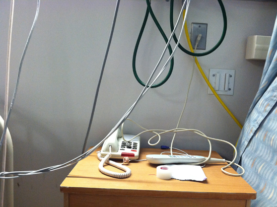
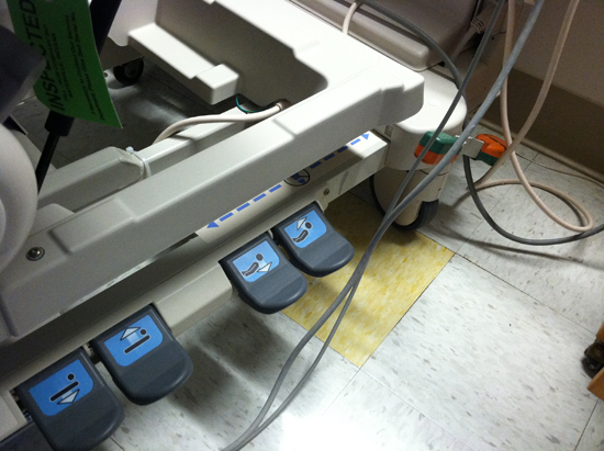
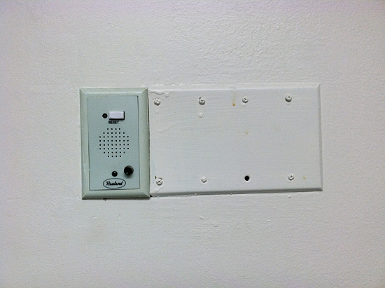
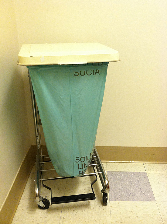
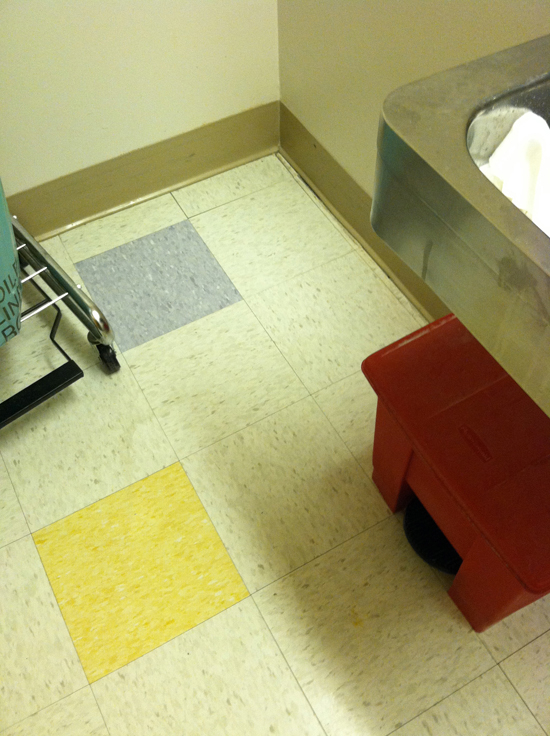
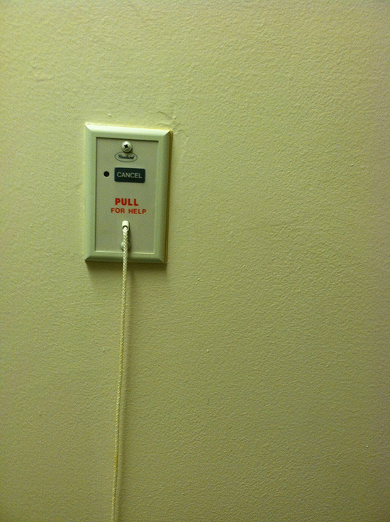
If one were to look at the dysfunction in our healthcare system through the lens of design, one could safely say that we are in deep deep trouble. I went to visit a close friend in the hospital this weekend, and I was aghast at all the cords and clip and tangles. There was absolutely no attention paid to aesthetics, much less usability, neither of which are insignificant or shallow, especially when one is ill or injured. My husband said it best: Hospitals aren’t designed for patients. They are designed for practitioners. I’m not even sure that is true.
Friday 11.05.10


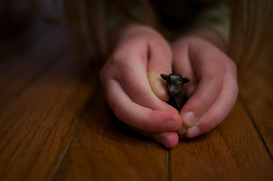
I thought this might be an effective (albeit temporary) palliative for some of the recurrent pain that accompanied today’s reading of the news. Notice, no baby elephants.
Thursday 11.04.10

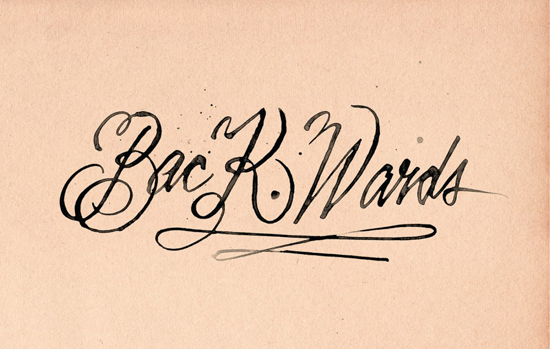
Well is it? Gosh, I hope not. Found this telling bit of typographic excellence at one of my favorite blogs, Friends of Type. I think we have Erik Marinovich to thank for this, but it’s a little hard to tell where the credit lies. It could also be from Uppercase, which is another much-loved site and magazine. Who knows. And in truth, I’m a little despondent right now, so I’ll leave it up to you to find out.
Copyright © 2010 - 2025 MELISSA EASTON, unless otherwise noted.


 3
3
