Monday 06.24.19
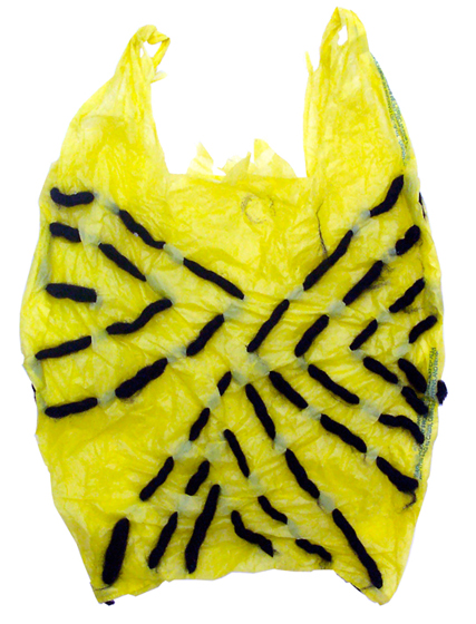
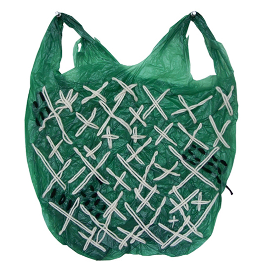
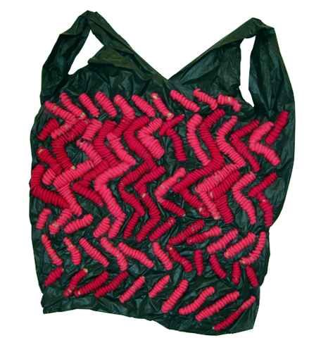
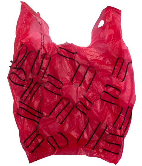
Yeah, yeah, I know, it’s been awhile. A titch over two years, if we want to be specific. I hope you’re all well. I’ve been pondering the many shifts in our methods and means of connecting with one another in this online ecosystem. In the past few years our lives have been transformed and, in some cases, taken over by social media. This may be a balm to some and a curse for others. I am deeply conflicted. On the one hand, it feels ridiculous to be sharing on the blog what is basically the equivalent of a novel. If it isn’t a single image, or confined to 140 characters, what’s the point. Oh, and the political climate has left so many of us reeling. Anything other than protest has seemed both trite and largely irrelevant. This is a partial answer as to why I stopped. It wasn’t a conscious decision, but something that happened more by slow attrition and inattention. Other reasons will be made clear over time. But I miss Mrs. Easton. It was a regular, self-imposed discipline, a personal diary of sorts, which forced me to look more closely at my surroundings, and to inquire about things that caught my attention, but of which I knew little. And, in many cases, almost nothing. I also miss the back and forth of the virtual community. It’s now been slightly more that 9 years since I started this endeavor. This here is an attempt to reestablish the routine. I hope you’ll join me.
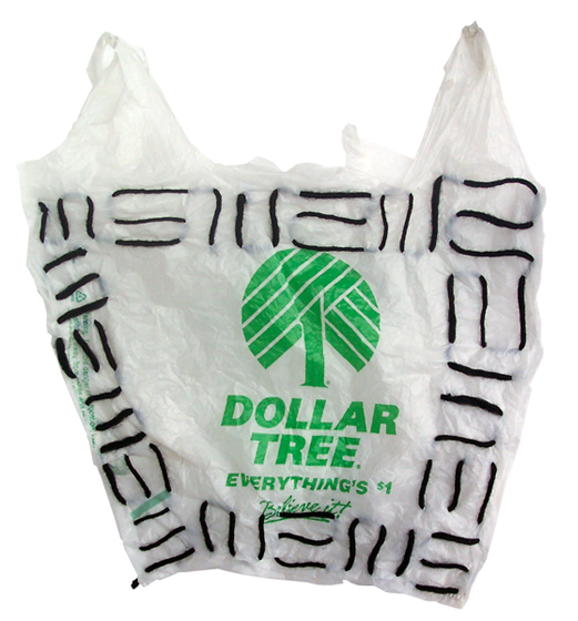
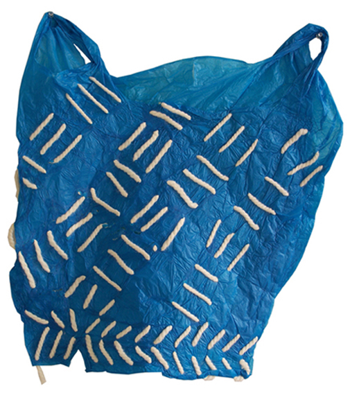
The above post was one of my very first, and feels even more relevant now than before.
These beauties are courtesy of the artist Josh Blackwell. Thank you Josh! I will never again look at my plastic bags the same way.
Friday 01.08.16


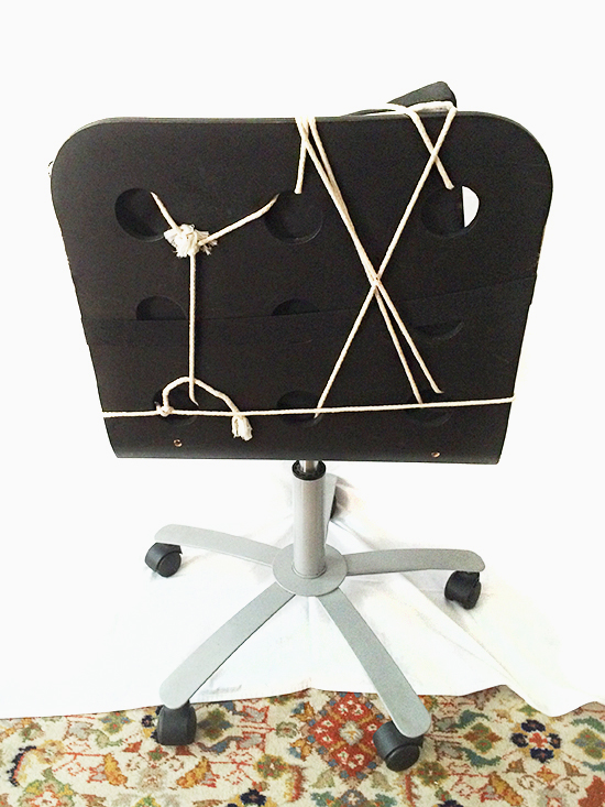
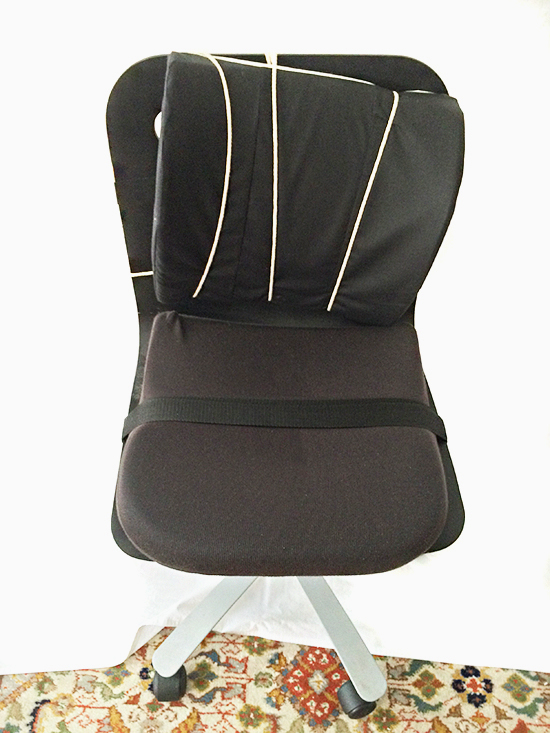
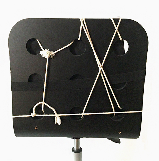
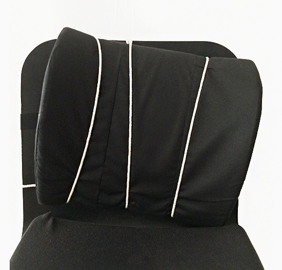
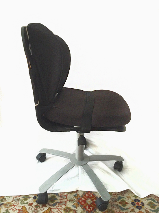
The importance of nature versus nurture is mostly one for the scientists. However, for me, the lay person, the question presented itself during a recent visit to my father’s home. You know how family behaviors or environments can be so familiar, to a point of near invisibility? Well, on this particular day, as I was sitting in my father’s study, his desk chair slowly came into focus. I’d looked at it many times before. I’d even sat in it. But never had I taken full stock of its Frankenstein qualities. As you can see, the seat is an assemblage of pillows and straps, all bound together with rope. It’s neither pretty nor comfortable. Although there is an interesting graphic quality to the way in which the rope weaves in and out of the holes. As an industrial designer, one who espouses simplicity and function, as well as comfort, I don’t in any way consider this to be a viable solution to the vexing question of what to sit on while at one’s desk. I’ve pondered the fact that the owner of the chair is indeed my father, and that I am his daughter. Dad, how did this happen?
Monday 05.19.14

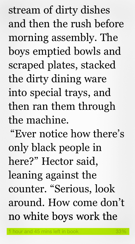
HUH? Why is the kindle app telling me how much time I need to finish my book? That is not how I want to think about reading. I suppose it’s a small, but telling, indication of how our culture has changed. It makes me a little sad, but it’s also the price one pays for reading a book on a digital device. Sort of a Faustian bargain.
Thursday 10.27.11


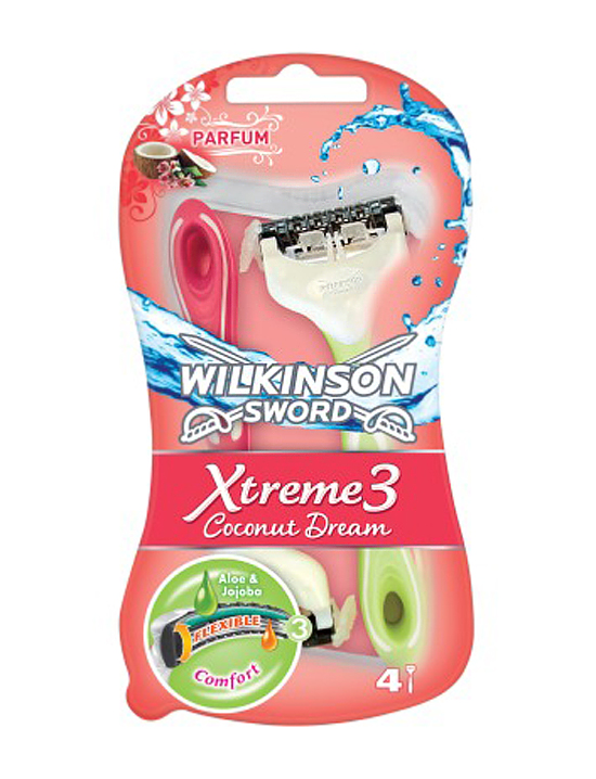
I was reading the actual paper version of the NYT this morning and was basically assaulted by the scent of perfume as I paged through one of the sections. Couldn’t figure out where the odor was coming from until I bent my head down to sniff an advertisement for…perfume. Blech. And then I was reminded of some razors I bought over the summer. They emitted a very pungent strawberry scent as soon as I removed them from the packaging. Again, I couldn’t initially figure out from where the aroma originated. And how had I missed the two little berries on the label? Something about this seems to have crossed a line. I’m still mulling over why it offends me. I did a little homework and found a story in the Times offering up various explanations (most of them pretty obvious, but still weird) as to why the last unscented bastion in our bathrooms has now succumbed to the forces of marketing.
Thursday 10.06.11

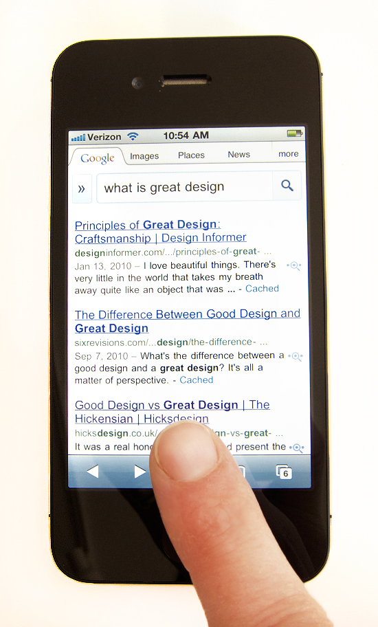
We all know that design can present itself as superficial or substantive or, more often, it’s some combination of both. We also know that when marketing, instead of need or innovation, dictates change, we find ourselves in the greatest amount of trouble. Good design is when form, function and operation are all considered and realized. And, at least to me, really great design is the convergence of all those elements but with the added goal of deliberately paring down and eliminating all extraneous detail. What one is left with is the absolute essence of a thing. Design in the hands of someone like Steve Jobs (and, to give due credit, Jonathan Ive and the many who work at Apple) was anything but a trivial matter. He made certain that we were not given a choice of how to use his products. Those devices dictated purpose and habits and touch. And they made us intuit our actions. Each successive generation of designs strove to get at the heart of how we converse with our environment. Ask yourself, have you ever seen someone really roughing up an iPhone? Probably not, because the interface and the form and the sounds all conspire to tell us how to interact with the thing. I marvel at Apple’s designs in part because of how they force our behavior into being something other than what it is. They even go so far as to demand both patience and attention. The many distinct little noises emitted by one or another device, as a result of touching a button or maybe scrolling down on a menu, tell us exactly what’s going on so we know if our actions have affected a change. So, not only is the “thing” pared down, but we are as well. We become less haphazard in our choices. And we ultimately become more precise and economical in our gestures. And, in the end, I believe we are the better for it.
Copyright © 2010 - 2025 MELISSA EASTON, unless otherwise noted.


 3
3
