Double Whirl
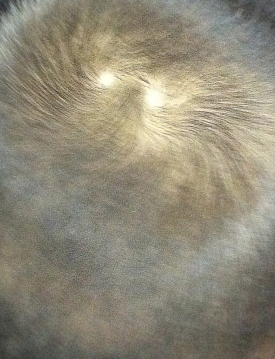
Back of a child’s head. Seen on the subway. Turned out very blurry. I love his double whirl cowlick.

Back of a child’s head. Seen on the subway. Turned out very blurry. I love his double whirl cowlick.
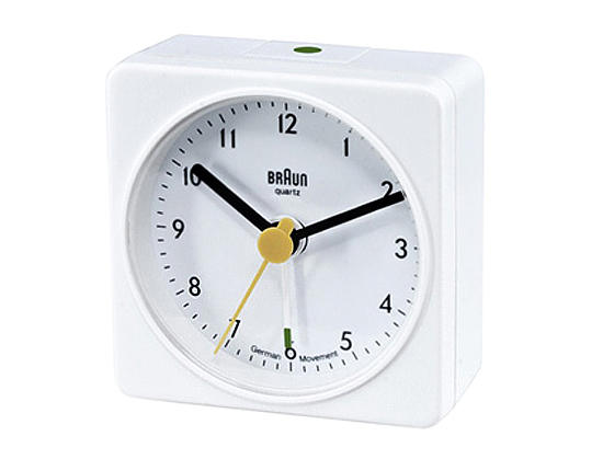
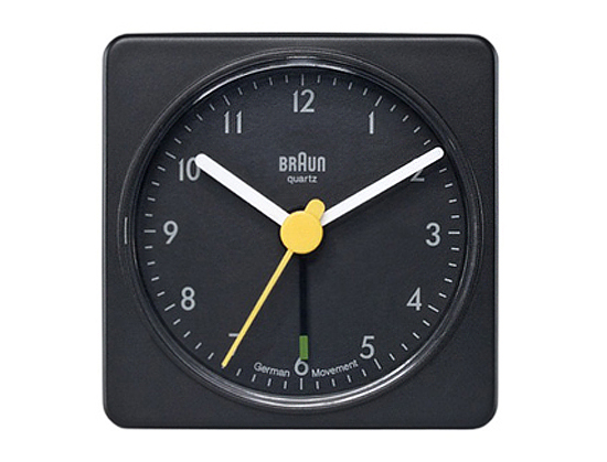
I went to buy a couple of new alarm clocks yesterday — we have a cat who is occasionally unruly and hurls everything on the bedside tables to the floor. no clock could stand up to such repeated abuse — and was reminded of how truly ridiculous we designers can be sometimes. As I was standing at the counter trying to decide between the black version or the white one and back again, the soft-spoken, very design-ey gentleman in charge of the shop inquired in the nicest way possible, “Does it really matter?” Instead of taking offense, as perhaps I should have, I burst out laughing. He’s right, it doesn’t freaking matter. It’s a clock for crying out loud. It’s unobtrusive, simple, well-designed. Who cares if it’s white or black? Would it really make a difference in my life one way or another? It’s not going to work better if it’s one color versus another. This particular clock is a re-issue of a design originally created in the 90s by Dietrich Lubs and Dieter Rams for Braun. Oh, and for the record, I bought two black ones.
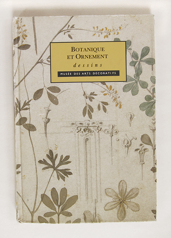
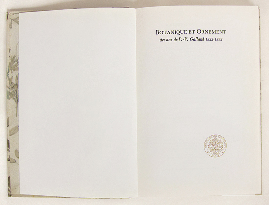
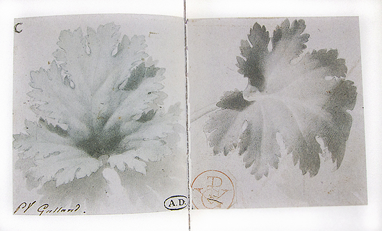
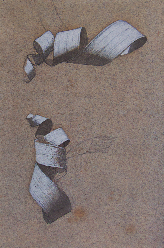
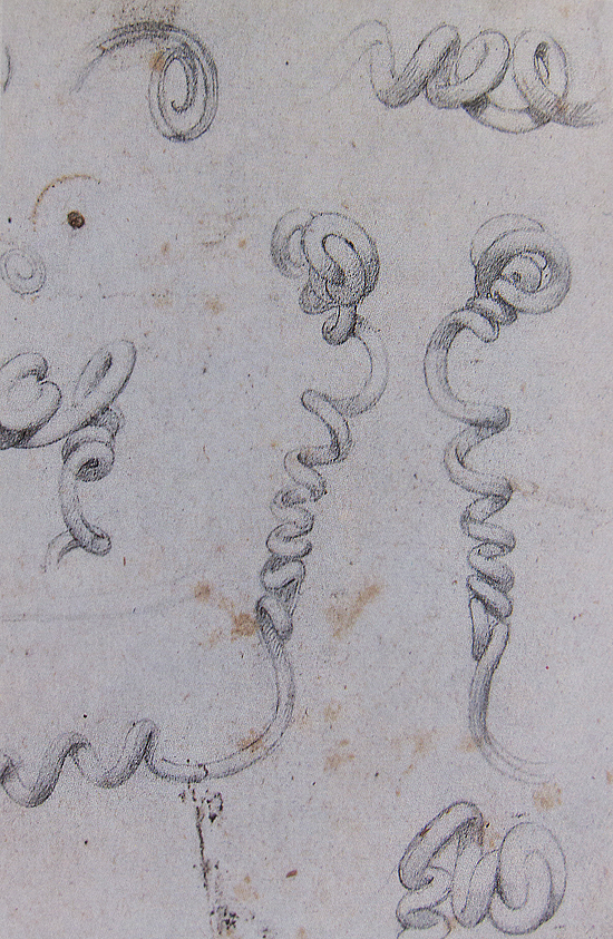
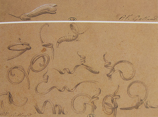
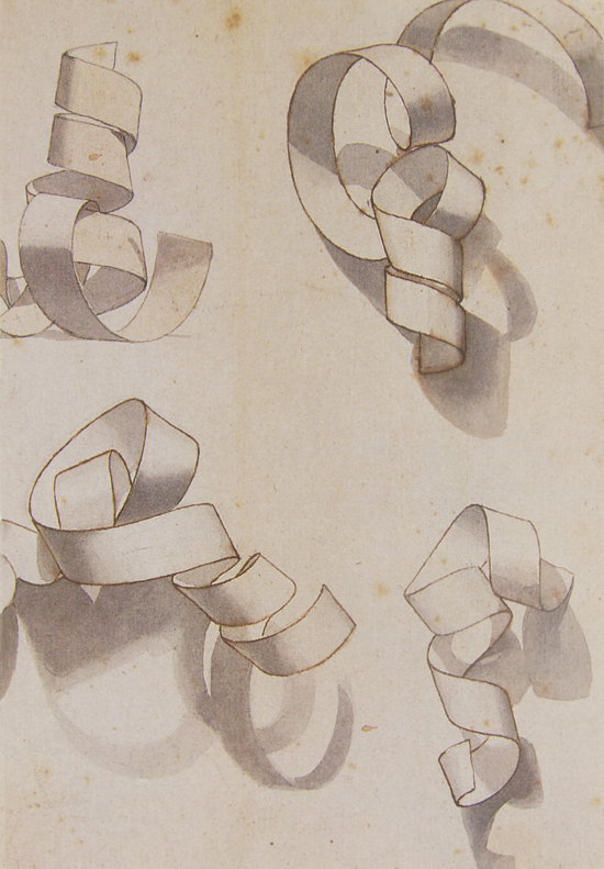
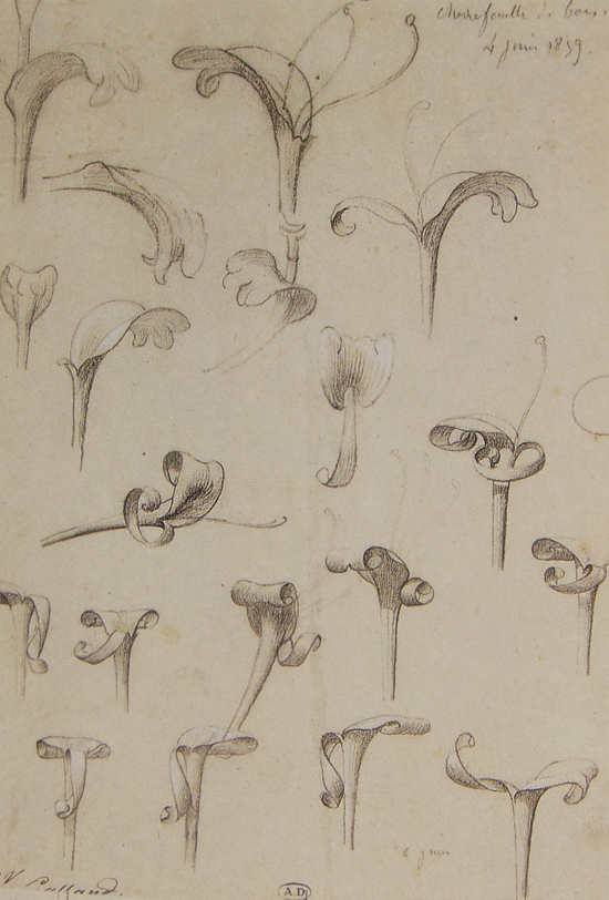
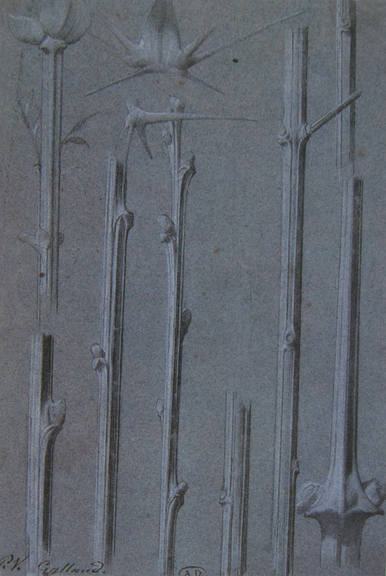
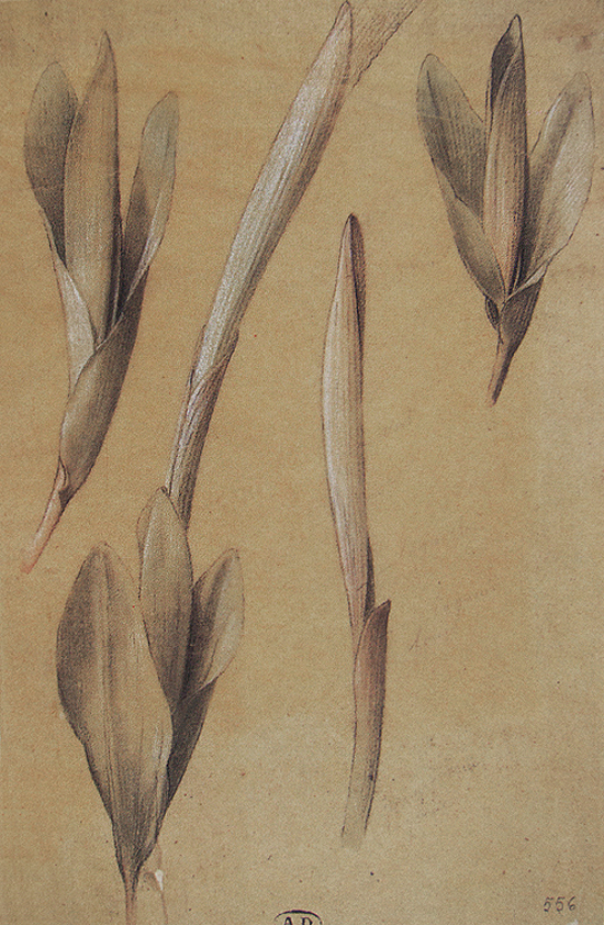
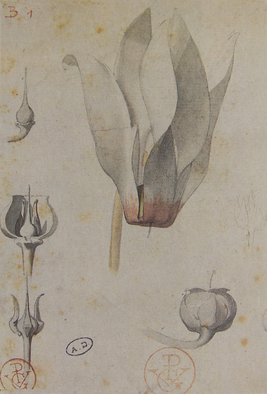
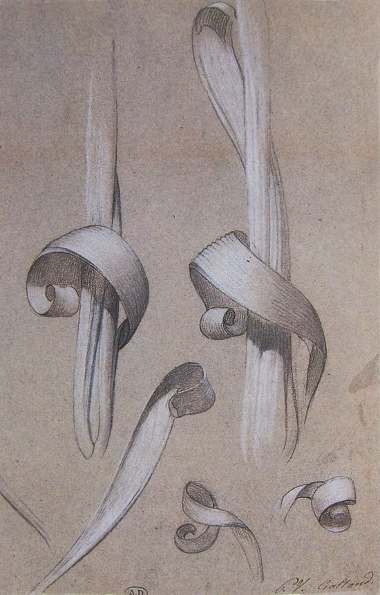
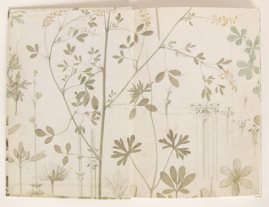
One of my favorite books. It measures in at 5.5″ x 8″. Part of a series of volumes that the Musée des Arts Décoratifs in Paris put out years ago that are sadly no longer in print. The hand in these drawings is both expert and full of delight. The book itself is intimate in a way that not many are. It is true about all design being found in nature. I go back to these pages over and over again. I am particularly fond of the curlicues.
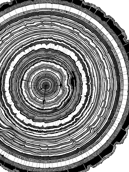
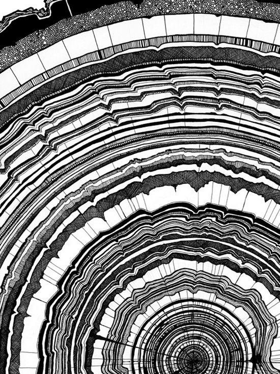
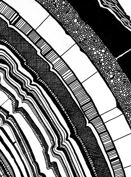
Saw these yesterday over at Picture Book. Always always a satisfying read! Tony Hong drew these tree rings on an 18′ x 24″ panel. Other people’s obsessions can be so satisfying.
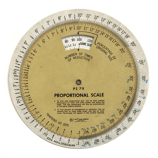
There are a lot of tools that I used to employ on a daily basis as a part of my work. This is one of the few I do not miss.